
Food Ordering
Platform


Date
2025
Location
Taiwan
My Role
UI/UX Designer
Client
Classified
Tool
Figma
Style
Minimalist, Warmth
Theme
UI Design
- Overview
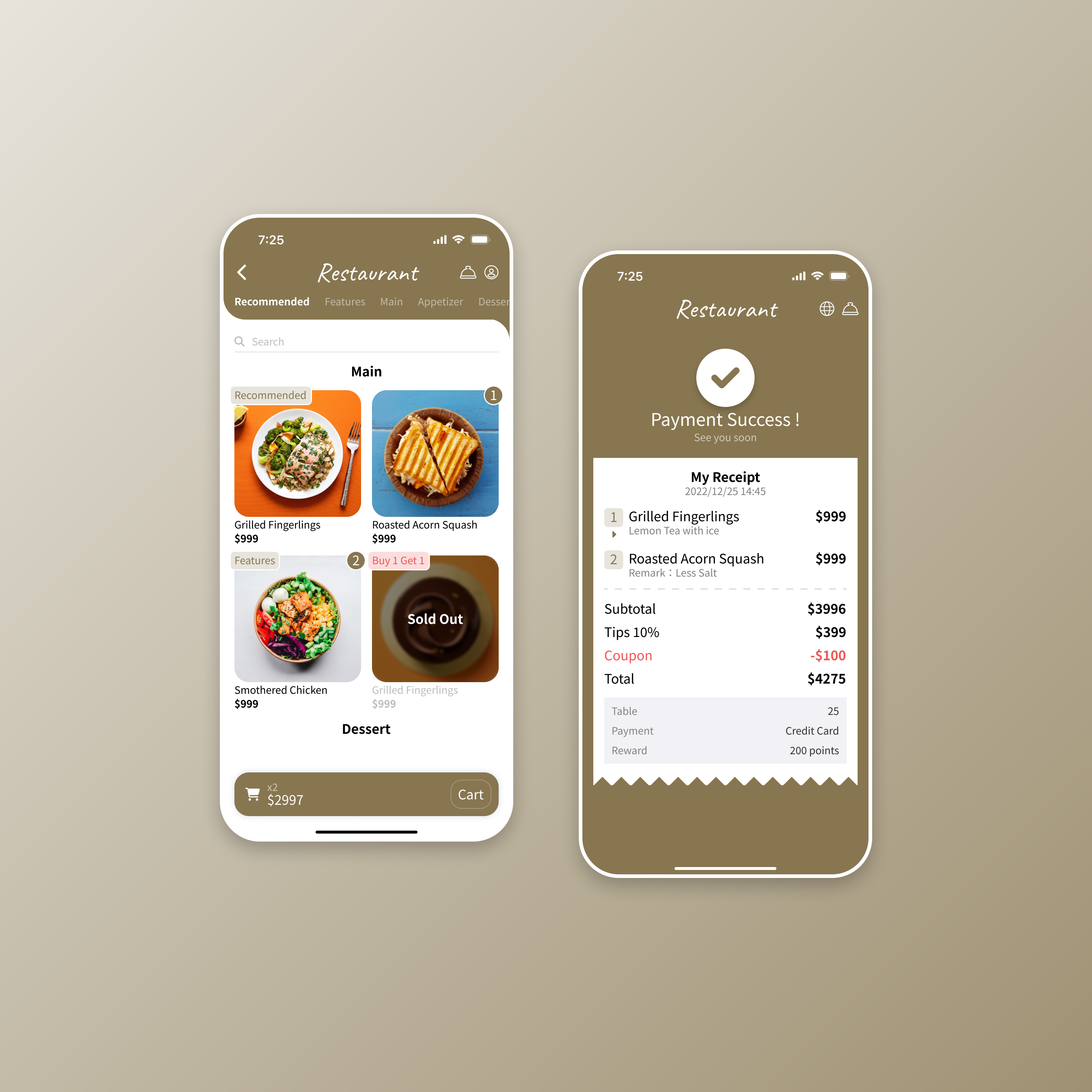
The design focused on creating a fast and intuitive food ordering experience that works seamlessly across dine-in, takeout, and delivery.
By simplifying the interface and information hierarchy, users can quickly browse, customize, and confirm orders with minimal friction. The design emphasizes clarity, visual balance, and consistency while aligning with restaurant brand identities and operational needs.
- Design & UI Element
I designed a modular interface built for scalability and ease of use. The visual system uses a clean grid, rounded components, and soft accent colors for accessibility.Key UI elements include:
- Dynamic cards for restaurant listings
- Interactive customization panel with real-time price updates
- Clear CTA buttons optimized for mobile ergonomics and thumb reach
- Result & Features
The final UI improved usability and reduced cognitive load for both customers and staff.
Key features:
- Unified interface for dine-in, takeout, and delivery
- Smart customization with live feedback
- Responsive layout for all devices
- Dashboard for restaurant insights
Testing showed a 25% faster ordering flow and 40% fewer tap errors during customization.
UX Research
- Problem statement
Small and mid-sized restaurants in Taiwan often face challenges managing dine-in, takeout, and delivery orders simultaneously. Staff shortages, high operational costs, and fragmented systems create inefficiency and errors.Customers, meanwhile, struggle with inconsistent order tracking and unclear customization options. The challenge was to design a unified, trustworthy experience that benefits both restaurants and diners.
- Research & Insights
We conducted interviews with restaurant owners, staff, and frequent app users to understand workflow pain points and customer frustrations. Competitive benchmarking revealed inefficiencies in order customization and delivery tracking.
Key insights:
- Restaurants need one centralized platform.
- Customers demand reliable ETAs.
- Clear customization UI reduces order errors.
- Transparency drives repeat use and trust.
- Solution & Outcomes
Based on the insights, we streamlined the ordering journey and improved transparency between restaurants and users.
Solutions: unified order flow, real-time delivery tracking, and simplified customization hierarchy.
Outcomes:
- Wait time reduced by up to 50%
- Staff workload down 20–30%
- Repeat orders doubled
User testing confirmed higher trust and smoother end-to-end interaction.

Food Ordering
Platform
Date
2025
Location
Taiwan
My Role
UI/UX Designer
Client
Classified
Tool
Figma
Style
Minimalist, Warmth
Theme
UI Design
- Overview
The design focused on creating a fast and intuitive food ordering experience that works seamlessly across dine-in, takeout, and delivery.
By simplifying the interface and information hierarchy, users can quickly browse, customize, and confirm orders with minimal friction. The design emphasizes clarity, visual balance, and consistency while aligning with restaurant brand identities and operational needs.
- Design & UI Element
I designed a modular interface built for scalability and ease of use. The visual system uses a clean grid, rounded components, and soft accent colors for accessibility.Key UI elements include:
- Dynamic cards for restaurant listings
- Interactive customization panel with real-time price updates
- Clear CTA buttons optimized for mobile ergonomics and thumb reach
- Result & Features
The final UI improved usability and reduced cognitive load for both customers and staff.
Key features:
- Unified interface for dine-in, takeout, and delivery
- Smart customization with live feedback
- Responsive layout for all devices
- Dashboard for restaurant insights
Testing showed a 25% faster ordering flow and 40% fewer tap errors during customization.
UX Research
- Problem statement
Small and mid-sized restaurants in Taiwan often face challenges managing dine-in, takeout, and delivery orders simultaneously. Staff shortages, high operational costs, and fragmented systems create inefficiency and errors.Customers, meanwhile, struggle with inconsistent order tracking and unclear customization options. The challenge was to design a unified, trustworthy experience that benefits both restaurants and diners.
- Research & Insights
We conducted interviews with restaurant owners, staff, and frequent app users to understand workflow pain points and customer frustrations. Competitive benchmarking revealed inefficiencies in order customization and delivery tracking.
Key insights:
- Restaurants need one centralized platform.
- Customers demand reliable ETAs.
- Clear customization UI reduces order errors.
- Transparency drives repeat use and trust.
- Solution & Outcomes
Based on the insights, we streamlined the ordering journey and improved transparency between restaurants and users.
Solutions: unified order flow, real-time delivery tracking, and simplified customization hierarchy.
Outcomes:
- Wait time reduced by up to 50%
- Staff workload down 20–30%
- Repeat orders doubled
User testing confirmed higher trust and smoother end-to-end interaction.